Wednesday, July 8 2015 - 12:00 AM
By: Neoriceisgood

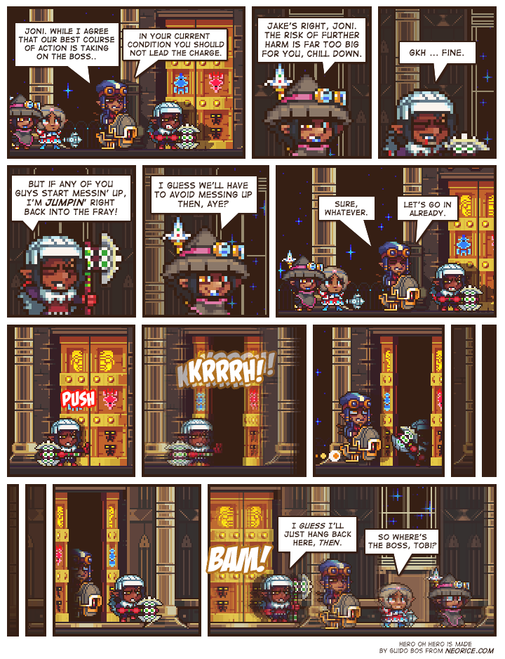
Just don't screw up.
Quick question to readers:
I've always had a bit of a dropshadow behind my text, but someone recently told me it made the text a bit hard to read.
Would you guys prefer the text without the drop shadow? I'm using this current page as an example.
In hindsight it does look a bit ... cleaner this way & is easy enough to fix/change on old pages. So if you guys prefer it let me know.


I do think the lack of a drop shadow makes it clearer to read. It never bothered me personally but I could understand why to others it could cause a problem. See what some others say as well!
I agree it looks much less blurry now. I did notice the shadow (and blurriness) but it was still readable for me. I like it much better without the shadow though.
I don't really have any trouble reading the dropshadowed text, myself.
Then again, that might just be my monitor.
It does look markedly easier to read, yeah.
Well, not EASIER, since it wasn't hard to do so before, at least for me, but it looks better and cleaner.
I think the dropshadow looks nicer, but this version does look cleaner and crisp. I can't really tell which looks better though.
I'll echo the others, it looks less blurry now though I never found it hard to read anyway.
Improvement, although the old isn't bothering me
i barely notice the difference
I'll voice the odd opinion of "I prefered the drop shadow text".
It was a bit harder to read, maybe, (and I can see why for some it really would be) but I always liked it. It gave the comic a little something extra (not that it needs anything extra; excellent job as always Neo). Made it feel almost more immersive.
@giovanni: I don't think I noticed any change until it was pointed out.
This way is a little bit better.
What's Dropshadow?
As a bit of a graphic design nerd, the only thing removing the shadow does for me is make the text more two-dimensional.
But I have 20/20 vision, and everyone sees things a little differently, so I'd aim for readability and simply drop the drop shadow ;P
I only noticed the difference now!
If I had to choose I'd say keep it without, it's slightly better.
I liked the dropshadow version more, it gave a certain depth to the text, which stylistically really fit the overall theme. The unshadowed version is cleaner, but also "flattens" the image a bit, making the comic more of a ... well, a comic, basically.
I'm perfectly fine with either version, though.
Everyone is so excited for adventure! Woooo...!
I thought the drop shadow was an interesting touch. But, like everyone else says, it does seem cleaner the new way.
While the dropshadow was an interesting style choice that I personaly had no trouble with like most.
The current 'flat' text is a lot crisper so probably a better choice to help appeal to a wider audiance that may have vision troubles or even disabilities that hinder their ability to discern unclear letters.
Otherwise keep up the good work on an interesting and funny comic =^.^=
I'm okay with the text either way. I didn't even notice the drop shadow, and while this version is cleaner, the drop shadow adds a certain oomph that I can't quite describe, but I like it now that I think about it. Perhaps you could use the drop shadow in certain parts of the texts, like when people would bold words. It isn't at all harder to read drop shadows.
Side note: I'm glad Joni is "on standby" instead of all out or in.
I dunno, I kinda liked it. Don't really care too much on it though.
The shadow was making it harder to read on my mobile device, so I prefer the shadowless text. :)
Well, I think it kind of loses its style without the dropshadow and it makes it look more generic.
Since I have this problem with other webcomics (difficulty to read) I read most of them with the page zoomed. With the dropshadow on I have to sit closer to the screen (or zoom) to read.
Either way this is one of the most readable webcomics, so you should just pick the one you like without too much thought because I don't think this is an issue. And it really won't make too huge a difference (stylistically).
Just don't overdo it with the changes, I'm still scared of last time hehe(a path to greater good);P. Kinda went out of control. Keep up the good work!
I only noticed the difference after reading your commentary, but I like it better with the dropshadow - as said before, it looks much less flat. I never had any trouble reading your text (unless you intended it).
Anyway, since I didn't notice it before you mentionned it, I guess it doesn't really matter.
I like it better without. Thanks for the comic!
While I did not have the issue, it is clearer and better readable, yes.
Yeh, I like it with.
I prefer the dropshadow, but I admit not using the dropshadow improves the legibility :)
Rataplan! Waiting for the boss... I am really excited what it will be. Maybe the yellow golem on the door? And I am glad that Joni wants to back off :)
The text doesn't bother me either way, at all.
It was plenty easy to read before and is now too.
dropshadow? wut dropshadow?
You're a funny guy.